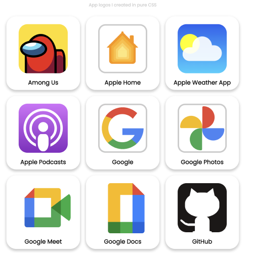
This started with a CSS tricks article and a youtube video by Web Dev Simplified in which they made basic shapes with CSS. I decided to repliate vector app icons.
For this project, I tried to replicate some brand and app logos in HTML and CSS. You can check out the project here.
The project uses CSS custom properties to make sizing easier along with calc() to make everything scale to the desired size.
:root {
	--logo-size: 200px;
}

.logo {
	height: var(--logo-size);
	width: var(--logo-size);

	/* border using calc */
	border: calc(var(--logo-size) * 0.03) solid #ccc;
	border-radius: calc(var(--logo-size) * 0.15);
}
The calc() function in css allows us to calculate things. It is a great tool to help out with making things in css. You can learn more about the calc() function here which is a video by YouTuber Kevin Powell, his channel is a great resource for CSS.
The other thing that was interesting is the creation of basic shapes in css such as a triangle, trapezium, etc which is well explained in this CSS tricks article.
For example you can use borders to create triangles (this with create an upward facing triangle):
.triangle {
	width: 0;
	height: 0;
	border: 100px solid transparent;
	border-bottom: 100px solid red;
}
The setting width and height to “0” is super important since otherwise it will not look like a triangle. Move the slider below to see the border thickness chnage.
Border Thickness: 80px
This is why you can use borders as triangles.
There was also one more trick I used pertaining to gradients where you can get a hard stop to a gradient when the end of another colour is the start of the next one.
.gradient-hard {
	width: 100px;
	height: 100px;
	background-image: linear-gradient(green 20%, blue 20% 60%, white 60%);
}Gradient Blue Percentage: 60%
Gradient White Start Percent: 60%
You can also do that same with radial-gradient and it can create hard stops between 2 circles. Since a gradient is a background-image, you can play around with the background-position and background-size properties as well to create patterns with it.
Border radius is also something you can mess with to create a leaf-like shape, you can play around with the unit either an absolute unit(px) or a relative unit(%).
Border Radius: 10px
These are maily the things I used for this project. There are many other creative ways to have fun with CSS.
Hope you had fun reading this article and have a great day!