Website for an architectural firm
This was a very unique website design idea, we went through multiple iterations and decided that the desktop version of the website will flow horizontally. You can find a link to the website here.
The Design
Making the website flow horizontally was a big challenge for responsiveness where I had to figure out where the website will break and make a horizontal design for it.
The design process went through multiple iterations and we finally came up with a design that worked.
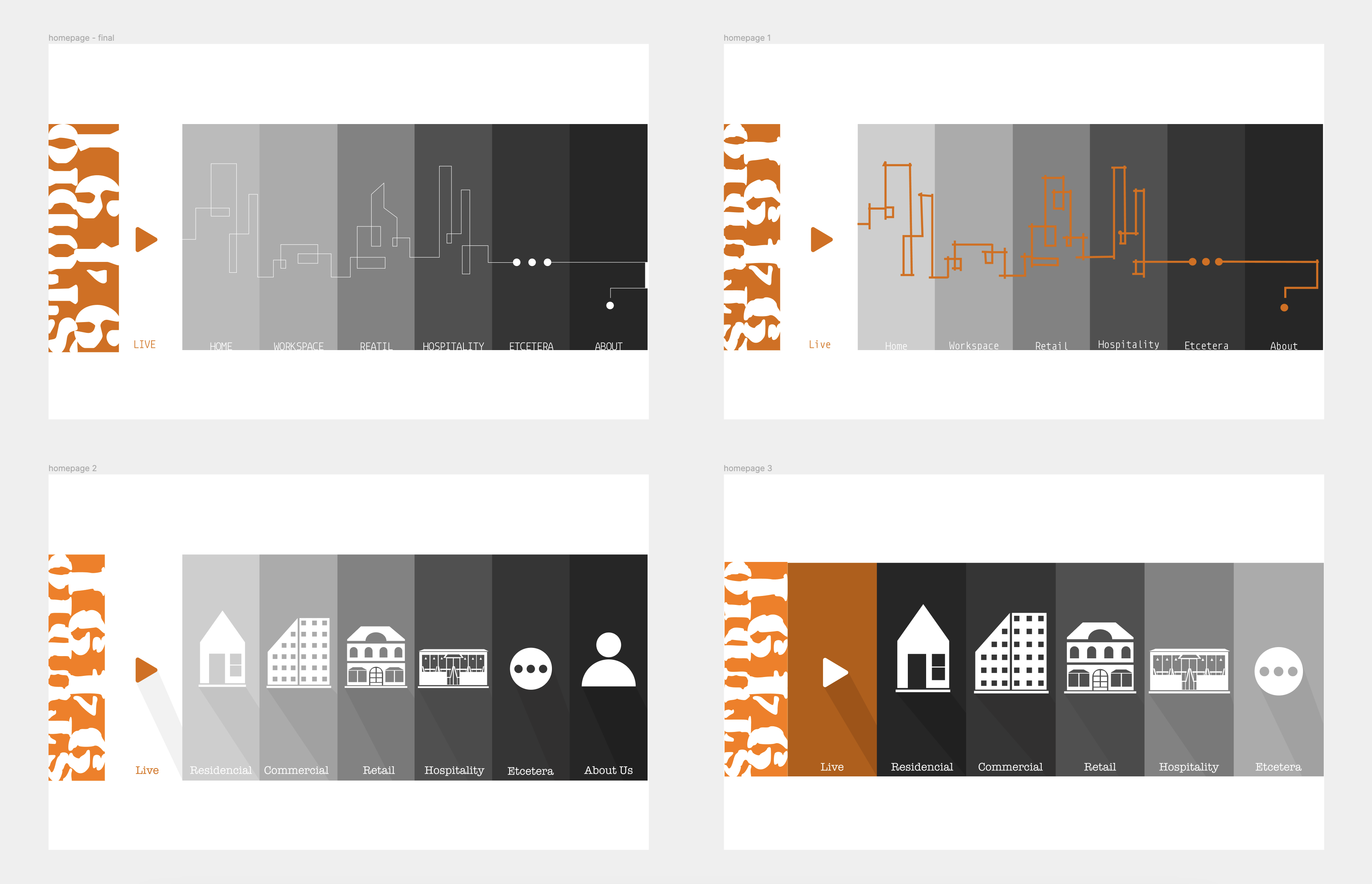
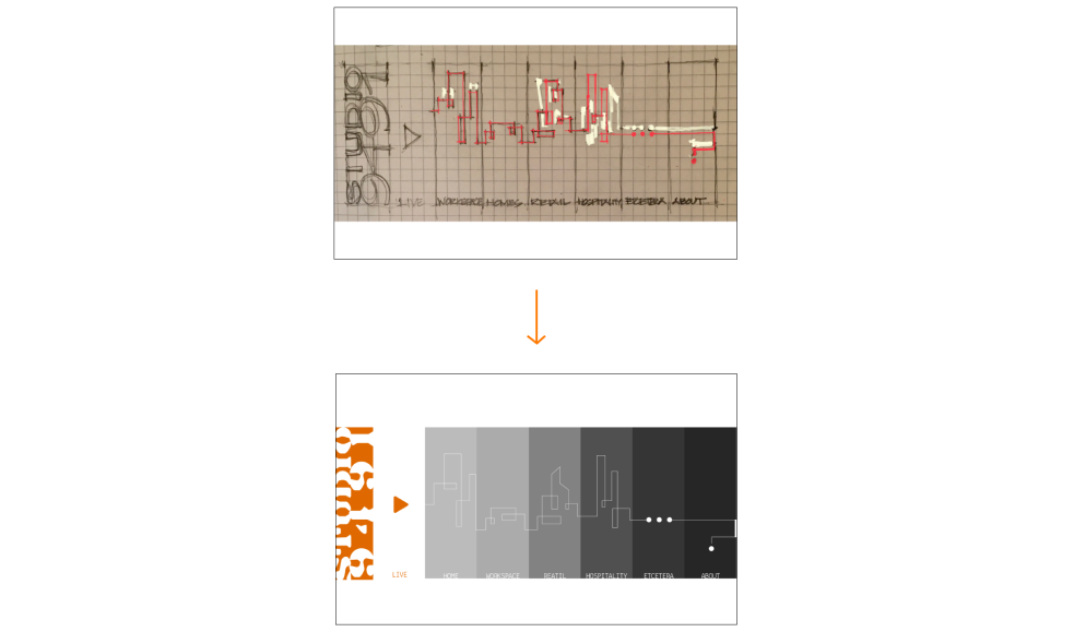
There is also an overlay on the homepage which was initially hand drawn and then traced in vector form.
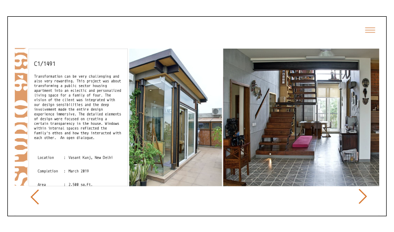
The rest of the site also flows horizontally on the desktop.
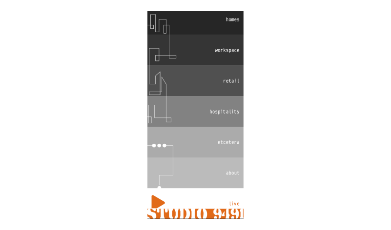
The mobile layout was a challenge since we had to change the homepage graphic to accommodate for a vertical flow. The whole site changes to flow vertically on a smaller screen.
The Frontend
This website was a bit challenging to implement in CSS as at the time of making the site I was learning about grid and flexbox. The site mainly used grid and flexbox in the CSS which was something a bit unfamiliar at the time I made the site, the horizontal layout mainly uses CSS grid.
The homepage was a bit of a challenge since I had individual links and had a hover effect for each link but I also needed to create one overly graphic which overplayed on the whole width of the page which I did by making the overlay a <div> with a background image and using position: absolute; to position it on top of the links. The image also has a pointer-events: none; so that the used can click through it.
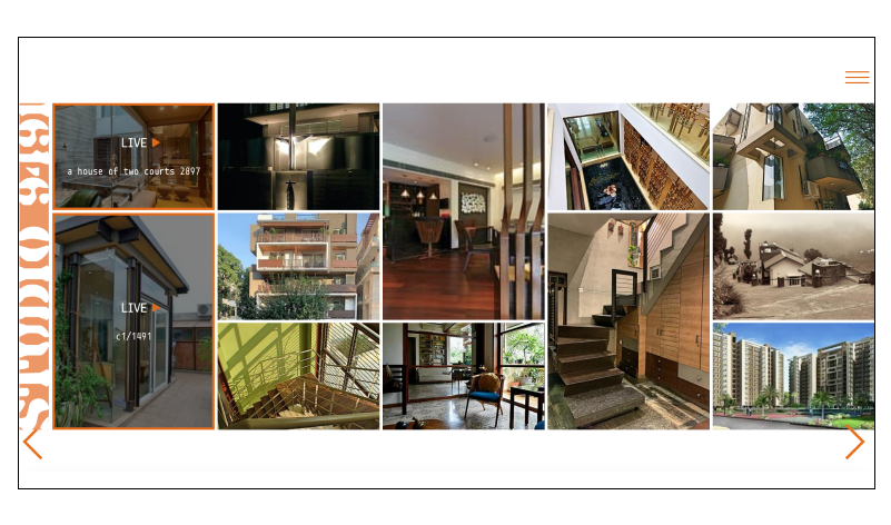
The CSS for the rest of the site was easier to write since I used CSS grid for the image grid for the project category pages and gave a grid-auto-flow: column; to make it flow horizontally instead of vertically.
In the projects grid, there was a pattern which is followed for the heights of the projects for which I created a set pattern and made an array according to the number of projects which determined how the pattern will repeat, this pattern consisted of 1s, 2s and 3s repeated. The pattern array looks as follows:
$grid = [1,2,1,1,1,2,1];
This array will be trimmed or repeated depending on the number of projects. This array will be looped through along with the projects and classes would be added such as height1, height2 and height3. These classes use grid-row-end: span 2; and span.
For the individual project pages, I used flexbox to make the images flow horizontally and changed the direction to vertical for the mobile view.
The Backend
The backed was done in PHP and MySQL. I also made a fully custom CMS to manage the site, the purpose was to make it as easy as possible to manage. This CMS includes dragging and dropping items to rearrange and a way to add, remove and edit projects and other content on the site. The content on every page except home and about can be edited through the CMS.
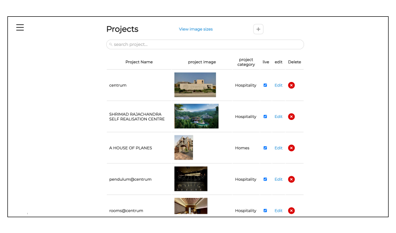
For more information about the CMS, you can check out this article .
This project was really interesting and challenging both, design wise and coding wise.